
Sunshine Coast Signage Project Gallery: Real Local Sign Installs by Suburb and Sign Type
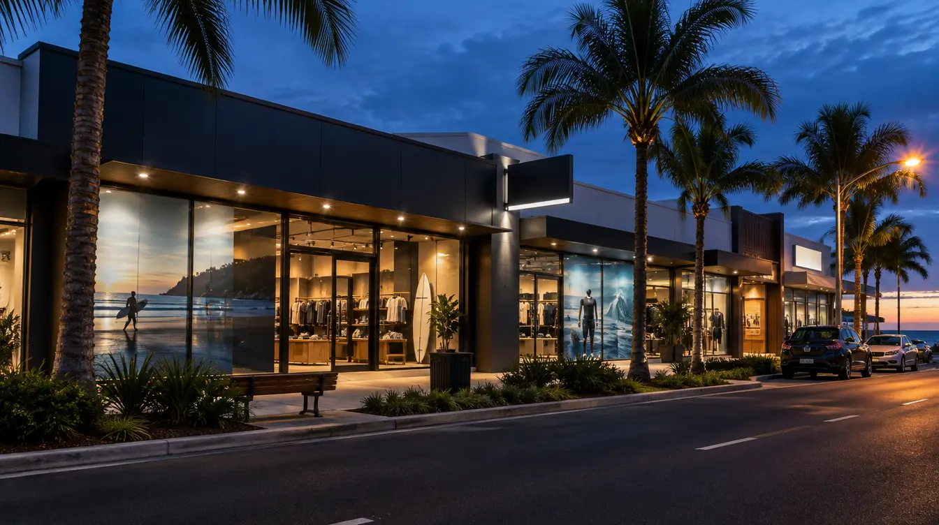
A good Sunshine Coast signage project gallery shows finished, installed signs in real streetscapes, sorted by suburb and sign type, with the brief, materials, coastal conditions and outcome for each. Use it to judge how a sign type handles salt air, UV and wind, then bring your favourites to the quote stage.
Most signage pages explain rules and costs. This one shows the work. I'm Alex Frew, founder of 3P Digital, and I've written this gallery for Sunquest Signs so business owners, shopping centre managers and builders can see what is achievable before they pick up the phone.
Every entry follows the same case note format: brief, sign type, materials, coastal factors, outcome and one lesson. Photos and job details are published only with client permission. Where a slot shows a bracketed note, the Sunquest team adds verified details from its job records (such as install duration) before the entry goes live. We do not publish figures we cannot back up.
Key Takeaways
- A real installed sign tells you more than a render. Look at fixings, edges, finish and how the sign reads from the street.
- Coastal conditions drive material choice: salt air attacks fixings and cheap finishes, UV fades inks and films, and wind loads decide footings.
- Shop fronts, illuminated signs, pylons and interior signs each fail in different ways, so judge each type on its own risks.
- Approvals, council rules and costs vary by site. Check the Sunquest suburb guides for Caboolture, Nambour, Kawana, Mooloolaba, Caloundra and Noosa rather than assuming a gallery example applies to you.
- The best way to use a gallery is to save examples, note sizes, materials and lighting, and share them at quote stage.
Ready to make your business impossible to miss?
Design, manufacture and installation, all under one roof in Warana.
Get a Free QuoteSummary Table: Sign Types at a Glance
| Sign type | Best suited to | Main coastal risk | What to check in a reference photo |
|---|---|---|---|
| Shop front fascia and window graphics | Retail, cafes, salons, services | UV fade and salt on fixings | Edge finish, colour consistency, fixing neatness |
| Illuminated and lightbox signs | Night trade, hospitality, clinics | Moisture ingress, UV yellowing of faces | Even light across the face, no hot spots, sealed joins |
| Neon (glass or LED neon) | Feature walls, venues, boutique retail | Outdoor exposure for indoor-rated products | Mounting detail, power supply location, after-dark photo |
| Pylon and building signs | Industrial estates, centres, multi-tenant sites | Wind loading and footing movement | Scale against the building, base detail, panel alignment |
| Interior, custom and wayfinding | Offices, clinics, retail fitouts | Sun-facing glass, high-touch wear | Legibility, contrast, mounting height |
Why a Local Project Gallery Matters
A local project gallery shows how signs actually perform on the Sunshine Coast, in real light, salt air and wind, on real buildings. Stock renders cannot show weathering, fixing detail or how a sign reads from the street. A gallery lets you judge materials and workmanship before you commit to a quote.
A render is a best-case picture. It has perfect light, no glare, no streaked fixings and no neighbouring shopfronts competing for attention. A photo of an installed sign has none of those luxuries, which is exactly why it is useful.
The Sunshine Coast is not one environment. Mooloolaba and Caloundra sit close to the beach, so salt carries onto facades and hardware. Noosa has its own streetscape character. Kawana and Caboolture have larger commercial and industrial sites where scale and wind loading matter more than finish alone. A gallery sorted by suburb lets you compare like with like.
When you look at any project photo, check four things:
- Fixings and edges. Clean, consistent fixings suggest careful install work. Rust streaks on older signs suggest the wrong hardware.
- Colour and finish. Do the colours match across panels? Is the face flat or rippled?
- Context. Is the sign sized for the building and the speed of passing traffic?
- After-dark view. For illuminated signs, daytime photos hide uneven lighting.
For council rules and cost breakdowns, the Sunquest guides for Caboolture, Nambour, Kawana, Mooloolaba, Caloundra and Noosa cover those in detail. This gallery deliberately does not repeat them.
Shop Front and Window Projects: Caloundra, Noosa and Mooloolaba
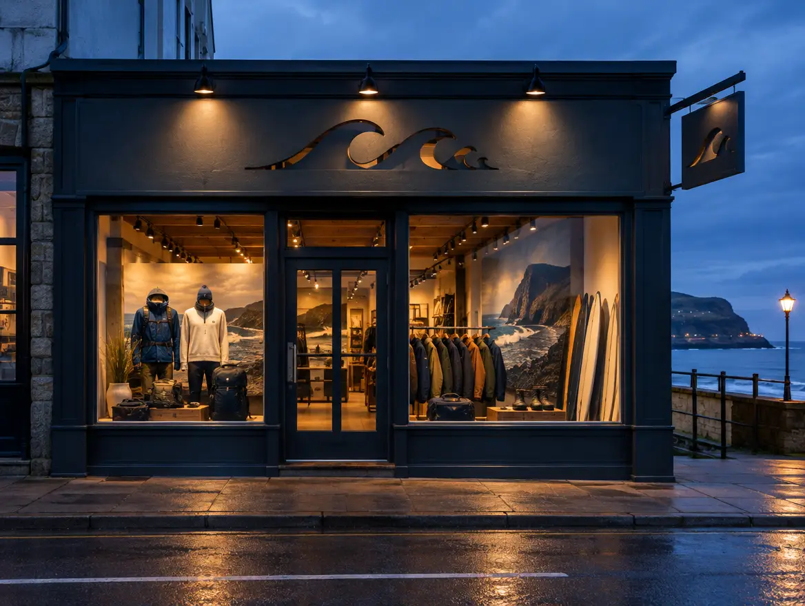
Shop front and window projects work best when the sign suits the building, the street and the weather. Along Caloundra, Mooloolaba and Noosa, that means marine-grade fixings, UV-stable films and layouts that read from both the footpath and the road. Each case note below shows what to look for.
The scenarios below are illustrative, written to show how a case note is structured and what decisions sit behind each sign type. Verified Sunquest project photos and details replace the bracketed notes as client permission is confirmed.
Caloundra: main street retail fascia and window graphics
Brief. Consider a Caloundra retailer taking over a tenancy with a tired, sun-faded fascia and plain glass. They need a clear business name from across the road and a window that sells without blocking the view in.
Sign type. Flat fascia panel with cut vinyl lettering, plus window graphics.
Materials. Aluminium composite panel with UV-stable laminated vinyl, and stainless fixings for any wall-mounted elements.
Coastal factors. Salt air near the beachfront, strong afternoon UV on west-facing glass and sea breezes that find loose edges.
Outcome. A readable name at street level, consistent colour across fascia and glass, and a surface that can be wiped down after salt-laden weather.
Lesson. Specify laminated films on sun-facing glass. Unlaminated vinyl is cheaper on day one but is the first thing to fade and lift.
[PHOTO PLACEHOLDER: Caloundra shop front sign, fascia and window graphics. Alt text guidance: suburb plus sign type, for example 'Caloundra shop front fascia sign with window decals'. Sunquest to add project name, install duration and client permission.]
Before and after note. Show the same angle from the opposite footpath, shot at the same time of day. The comparison should make the change in legibility obvious without captions.
Noosa: restrained shop front identity
Brief. Consider a boutique in a Noosa retail strip where the streetscape favours understated, high-quality signage over loud branding.
Sign type. Dimensional lettering on a feature wall, with a small projecting blade sign.
Materials. Brushed or powder-coated metal letters on stainless stand-offs, painted to suit the facade.
Coastal factors. Humidity and salt exposure, plus filtered UV under awnings that still fades cheap finishes over time.
Outcome. A sign that looks established and complements neighbouring tenancies rather than competing with them.
Lesson. In sensitive streetscapes, restraint and material quality carry the brand. The Noosa signage guide covers local requirements, so check it before you finalise a design.
[PHOTO PLACEHOLDER: Noosa dimensional lettering shop front sign. Alt text guidance: 'Noosa shop front sign with raised metal lettering'.]
Mooloolaba: hospitality fascia and window branding
Brief. Consider a Mooloolaba cafe wanting to stand out to foot traffic along a busy tourist strip, day and night.
Sign type. Fascia sign with a projecting blade sign and printed window graphics.
Materials. Marine-grade aluminium framing, UV-resistant printed graphics and sealed edges.
Coastal factors. Direct salt spray, wind funnelling between buildings and strong UV for much of the year.
Outcome. Visibility from both directions of the footpath, not only head-on.
Lesson. Add a blade sign. Footpath traffic sees the side of your building before the front.
For more on this category, see Sunquest's Shop Front Signs on the Sunshine Coast page and the Window Decals and Graphics page.
Illuminated, Lightbox and Neon Projects
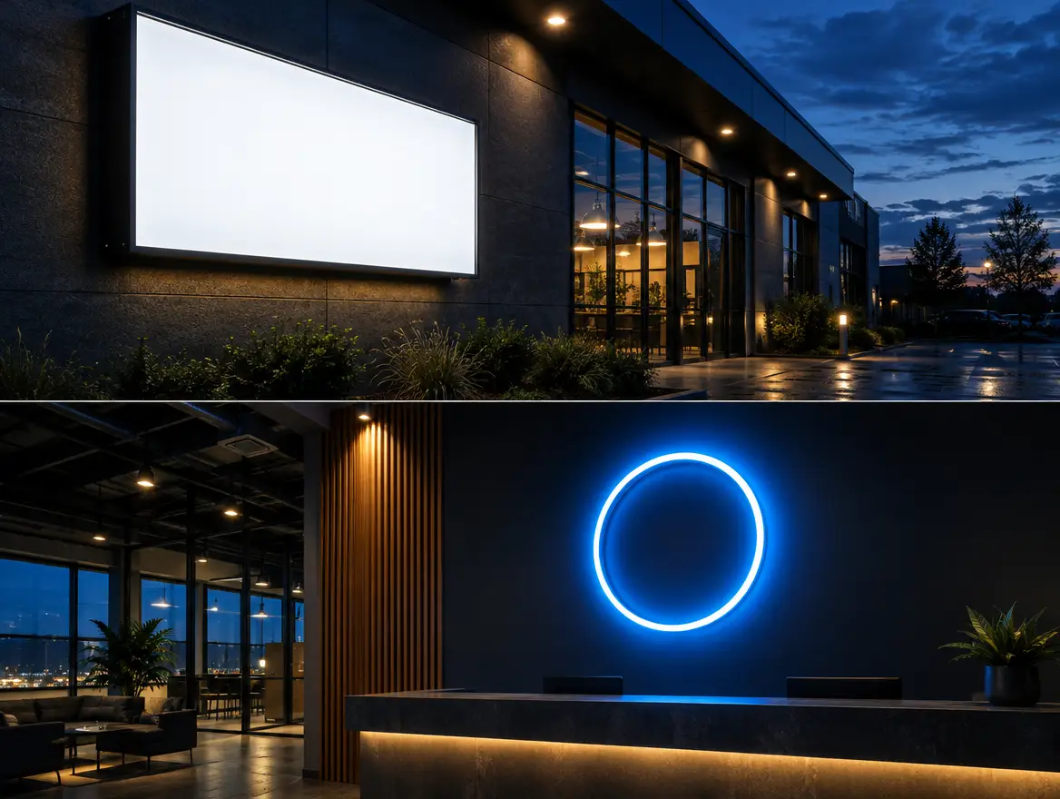
Illuminated, lightbox and neon signs earn their keep after dark, so judge them at night. LED has largely replaced older lighting because it runs cooler, lasts longer and suits sealed housings. The right choice depends on whether the sign sits outdoors, how far it must be read and how even you want the glow.
A lightbox is a sealed cabinet with an LED-lit face. A channel letter sign lights each letter individually. Neon comes in two forms: traditional glass neon, and LED neon flex, which is a flexible LED strip in a silicone sleeve that mimics the look.
Choosing between LED options
For outdoor coastal sites, LED neon flex is usually more practical than glass. It is more resilient to knocks, it is lighter and it handles outdoor conditions better when specified for exterior use. Glass neon still has a distinct warmth, and many venues choose it for interior feature walls where it is protected.
The key specification is exposure. A product built for indoor use will not last on a salt-exposed outdoor wall, however good it looks on a showroom floor. Ask whether the product is rated for outdoor use and how the power supply is protected.
Case note: illuminated fascia for night trade
Brief. Consider a clinic or restaurant that trades into the evening and needs its name visible from the road after dark.
Sign type. Illuminated lightbox or LED channel letters.
Materials. Aluminium housing, UV-stable acrylic faces and sealed LED modules.
Coastal factors. Moisture and humidity can find their way into poorly sealed cabinets, and UV can yellow cheap acrylic over time.
Outcome. Even illumination across the face, with no visible hot spots from the LEDs.
Lesson. Ask to see an after-dark photo. Uneven lighting is the most common giveaway of a rushed build.
[PHOTO PLACEHOLDER: illuminated lightbox sign at night. Alt text guidance: suburb plus sign type, for example 'Kawana illuminated lightbox sign after dark'. Sunquest to add verified job details.]
Case note: neon feature wall
Brief. Consider a bar or retail fitout wanting a bold neon logo as an photo-worthy feature.
Sign type. LED neon flex on a clear or painted backing.
Materials. Silicone neon flex, acrylic backing and a concealed power supply.
Coastal factors. For outdoor or open-air sites, salt and UV exposure decide whether a product is suitable. For indoor sites, glazing that bakes in afternoon sun still matters.
Outcome. A signature piece that photographs well and reinforces the brand.
Lesson. Plan the power supply position early. Hidden wiring is the difference between a sign that looks designed and one that looks added.
Sunquest's hubs for Neon Signs and Illuminated and Lightbox Signs cover the product ranges in detail.
Pylon and Building Signs: Industrial Estates, Kawana and Caboolture
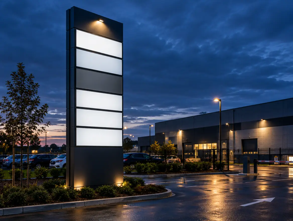
Pylon and building signs are engineering projects first and graphic projects second. Scale, wind loading, footings and approvals decide whether a sign is safe and permitted. On industrial estates and commercial sites around Kawana and Caboolture, they must also be legible from a moving vehicle at a distance.
A pylon sign is a freestanding structure. It carries more load than a wall sign because it catches wind with a small footprint on the ground. Design wind speeds are set by the site's wind region and terrain, using the loading rules in the AS/NZS 1170.2 wind actions standard.
Scale, footings and approvals in brief
Three points matter most:
- Scale. Letter height and panel size should suit the speed and distance of passing traffic, not just the building.
- Footings. A pylon needs an engineered footing that suits the soil and the wind load. A footing is not a place to save money.
- Approvals. Whether you need approval depends on the site, the size and the zoning. Check with council, and read the relevant Sunquest suburb guide.
Sunquest covers the engineering process in its Pylon Sign Engineering and Installation guide.
Case note: multi-tenant pylon at a commercial site
Brief. Consider a Kawana commercial centre with several tenants and a pylon that has aged badly, with faded panels and mismatched tenant branding.
Sign type. Multi-tenant pylon with replaceable tenant panels.
Materials. Powder-coated steel structure, aluminium panels and UV-stable printed faces.
Coastal factors. Wind load on a tall structure, salt-air exposure on steel and UV on large printed surfaces.
Outcome. A consistent, current-looking sign that lets tenants change panels without touching the structure.
Lesson. Design for panel changes from day one. Tenants turn over, and a sign that cannot adapt becomes outdated quickly.
[PHOTO PLACEHOLDER: Kawana multi-tenant pylon sign. Alt text guidance: 'Kawana multi-tenant pylon sign at a commercial centre'. Sunquest to add install duration from job records.]
Before and after note. Shoot the pylon from the approach road, where drivers first see it, rather than from the car park. That angle shows whether the change actually improved legibility.
Case note: industrial estate building signage
Brief. Consider a Caboolture trade business on an industrial estate with a large blank facade and customers who struggle to find the entrance.
Sign type. Large-format building sign with entrance identification.
Materials. Aluminium composite panels or dimensional letters, fixed to suit the wall construction.
Coastal factors. Wind exposure on open sites and UV on large surfaces.
Outcome. A clear business name from the road and a clearly marked entrance.
Lesson. Identify the entrance, not just the business. Signs that say who you are but not where to go leave customers circling the block.
Interior, Custom and Wayfinding Projects
Interior and wayfinding signs succeed when people find their destination without asking. Offices, clinics and retail fitouts need clear hierarchy, strong contrast and consistent mounting heights. Custom pieces, such as feature logos and reception walls, set the first impression the moment a visitor walks in.
Interior work faces a different set of problems from exterior work. There is no salt spray, but there is sun through glazing, heavy touch on doors and glass, and building requirements that govern some sign types.
Offices and clinics
In clinics and larger offices, wayfinding has a practical job: getting people to the right room with minimal stress. Use a consistent system for room names, directions and door signs. The National Construction Code sets requirements for Braille and tactile signage in certain buildings, so confirm with your certifier what applies to your fitout.
Lesson. Plan the signage schedule during design, not at the end of the fitout. Retrofitting wayfinding around finished walls costs more and looks worse.
Retail fitouts
Retail interiors use signage as part of the brand. Feature walls, shelf talkers, category signs and window graphics all need to work together. Sunquest's Retail Signage Fitouts page covers this work in more detail.
[PHOTO PLACEHOLDER: retail fitout interior signage. Alt text guidance: suburb plus sign type, for example 'Maroochydore retail fitout with feature wall sign'.]
Lesson. Keep a consistent type hierarchy. Mixed fonts and sizes across a fitout make a premium space look improvised.
How to Use the Gallery to Brief Your Own Project
Use the gallery as a briefing tool. Save the examples you like, note the sizes, materials and lighting, and share them at quote stage. A screenshot plus your site address lets Sunquest quote a similar sign tailored to your building, rather than a generic version of it.
A short, specific brief gets a faster and more accurate quote than a vague one. Here is what to collect before you enquire:
- Two or three example photos. Include the one you like most and one you dislike, so the team understands your taste.
- Your site address. Location sets wind exposure, salt exposure and the approval path.
- Photos of your facade. Shoot from across the road and up close, at day and night.
- Rough sizes. Measure the fascia or wall area. Approximate is fine.
- Mounting surface. Brick, render, metal cladding or glass all change the fixing method.
- Lighting. Say whether you want illumination, and whether you trade after dark.
- Landlord or centre approvals. Tell us if you are a tenant, because approvals can add time.
- Deadline. Share any launch date or event so timing is built into the plan.
The more you share, the less guesswork sits inside the quote.
Seen a project you like? Send us a screenshot and your site address and Sunquest Signs will quote a similar sign tailored to your shopfront. Use the contact form on the Sunquest Signs website, or call the team on the number listed there.
Judge a Sign by Its Third Year, Not Its Install Day
The most useful question to ask about any signage gallery is how the sign looks now, not how it looked on install day. Every sign looks good in its launch photo. Coastal conditions only show their effect over time, and that is where quality separates from marketing.
Here is my position, and it is one I hold firmly: a gallery of day-one photos is the weakest evidence a signage company can offer. A sign is a long-term asset. It sits in salt air, full sun and wind for years. What matters is whether the finish, the fixings and the lighting still look right then.
So when you assess any gallery, including this one, ask for two things:
- An aged install. Ask whether the supplier can show you a sign that has been up for a few years and how it has held up. A company confident in its materials will not hesitate.
- The specification, not just the photo. Ask what films, laminates, fixings and LED products were used. A good-looking sign made with the wrong materials is a short-term result.
This is also why the case notes in this gallery list materials and coastal factors alongside the outcome. A photo shows what a sign looks like. A specification shows whether it will keep looking that way.
I would rather see a business choose a slightly more modest design in the right materials than a bold one that fades in two summers. In my experience as a marketer, signage that looks tired actively works against a brand, because it signals neglect to the very customers you are trying to win.
References
- Standards Australia, AS/NZS 1170.2 Structural design actions: Wind actions
- Australian Building Codes Board, National Construction Code
- ARPANSA, Ultraviolet radiation information
- Bureau of Meteorology, Australian weather and climate information
- Sunquest Signs, official website
Talk to a signage expert
Tell us about your project and we'll come back with options and honest advice.
Get in TouchFrequently Asked Questions
What is a signage project gallery?
A signage project gallery is a collection of finished, installed signs, usually grouped by location or sign type. A good one shows the brief, materials and outcome for each project, so you can judge quality and relevance before requesting a quote.
Why do Sunshine Coast signs need coastal-specific materials?
Salt air corrodes cheap fixings, UV fades inks and films, and sea breezes put strain on poorly secured panels. Marine-grade fixings, UV-stable finishes and sealed housings help signs keep their appearance and structure in these conditions.
Can I ask for a sign similar to one in a gallery?
Yes. Send the example along with your site address and facade photos. A similar sign is tailored to your building, size, mounting surface and lighting needs, rather than copied exactly.
Do I need council approval for a shop front or pylon sign?
It depends on the site, the size, the zoning and the type of sign. Pylons and large illuminated signs are more likely to need approval than a simple window graphic. Check the relevant suburb guide and confirm with council.
What is the difference between glass neon and LED neon?
Glass neon uses gas-filled glass tubes and has a distinctive glow, but it is fragile. LED neon uses flexible LED strip in a silicone sleeve. It is lighter, more resilient and generally more practical for outdoor or high-traffic locations when specified for exterior use.
Related Articles
Signage in Caboolture: Sign Options for CBD, Morayfield and Industrial Businesses, Council Rules and Costs
Signage in Nambour: Sign Options for CBD, Heritage and Industrial Businesses, Council Rules and Costs
Signage in Kawana: Sign Options for Birtinya, Buddina and Warana Businesses, Approvals and Costs
Signs that set you apart
Over 40 years on the Sunshine Coast. Design, compliance, manufacture and installation handled end to end.
Get a Free Quote