Business Logo Neon Signs: Turning Your Brand Mark into Custom LED Neon
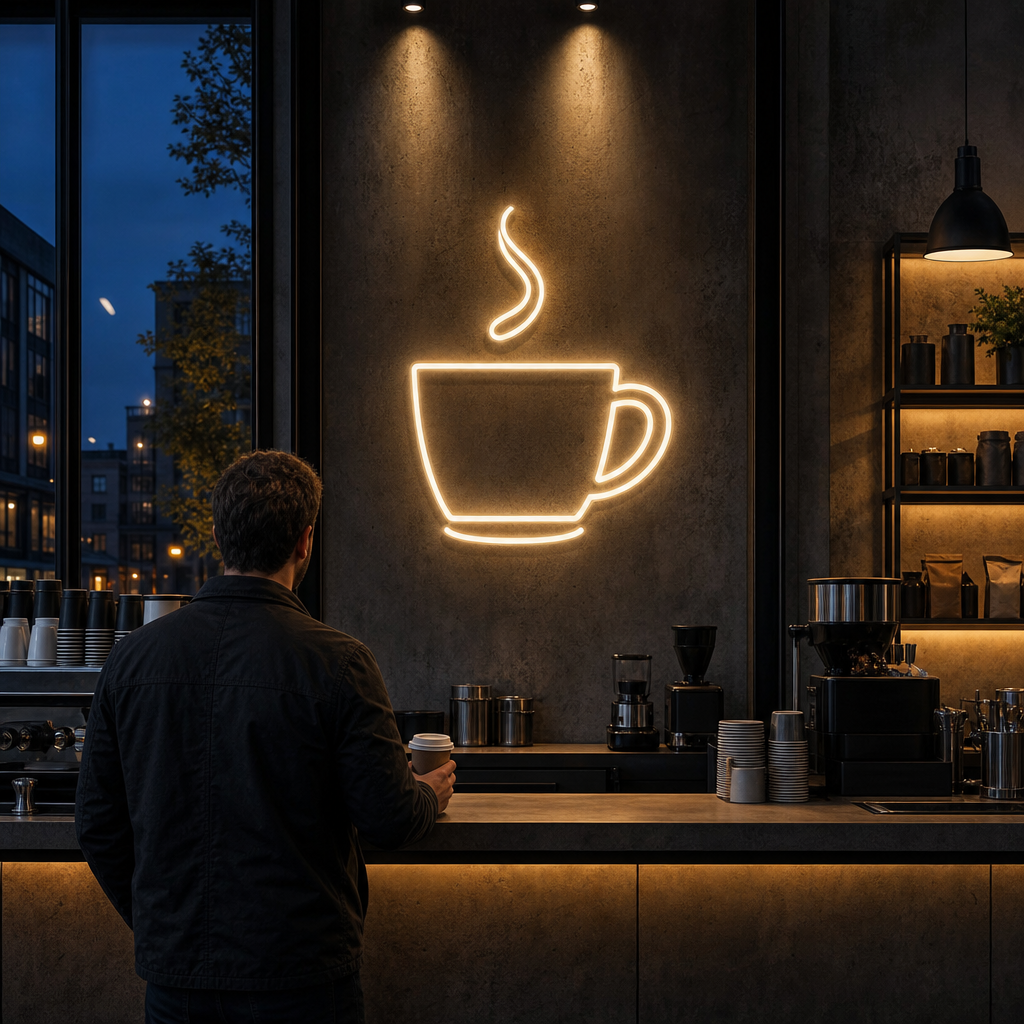
A business logo neon sign is a custom LED neon sign built from your existing brand mark. The signmaker converts your vector logo into continuous light paths, simplifies fine detail, matches your brand colours to available LED colours, and mounts the result on an acrylic backing for a wall, window or suspended install.
Most owners already have a logo they like. The question is whether it survives the trip from a flat screen file to a glowing, bendable line of light. Some logos convert almost untouched. Others need careful simplification, and a few need a separate neon version of the mark.
This guide stays focused on the logo itself. You will see what makes a logo neon-ready, how designs get simplified without losing recognition, how colours are matched, and where logo neon performs best in cafés, salons, gyms, offices, boutiques and venues. For backing types, running costs and care in general terms, see our Custom LED Neon Signs: A Complete Guide.
Key Takeaways
- Logo neon works because it combines brand recall, a photo-ready backdrop and after-hours visibility in one fixture.
- Line-based logos convert most easily. Filled shapes, gradients and fine detail usually need outlining or redrawing.
- A vector file (AI, EPS, SVG or a clean PDF) is the best starting point, and a mock-up should be approved before anything is built.
- LED neon colours are light, not ink, so brand colours are matched as closely as possible rather than copied exactly.
- Cut-to-shape acrylic suits logos with a strong silhouette. Rectangular backing suits wordmarks and complex marks.
- Viewing distance and exposure to weather decide size, placement and whether neon or a lightbox suits the external facade.
Ready to make your business impossible to miss?
Design, manufacture and installation, all under one roof in Warana.
Get a Free QuoteSummary Table
| Logo element | How it behaves in LED neon | Typical solution |
|---|---|---|
| Single-weight line art | Converts directly | Trace the paths, keep the layout |
| Bold filled shapes | Cannot be filled with light | Outline the shape or use a solid acrylic print layer |
| Gradients and shading | Not reproducible in a single tube | Pick one or two colours, or use an RGB option |
| Fine detail and small text | Gets lost or merges | Remove, enlarge or move to the acrylic backing |
| Script lettering | Possible if strokes are even | Simplify joins and tight loops |
| Icon plus wordmark | Works as a combined or split sign | Choose one hero element, or build two pieces |
| Outdoor or weather-exposed use | Needs suitable protection | Use inside the window, or choose a lightbox or channel letters outside |
Why Logo Neon Works for Local Businesses
Logo neon works because it puts your brand mark in light at the points where customers pause: the reception wall, the counter and the window after dark. It builds recall through repetition, gives customers a ready-made photo backdrop, and keeps your brand visible when the doors are closed.
Brand recall through repetition
A logo printed on a menu or a business card is seen once, then forgotten. A logo lit on the wall behind the counter is seen every time someone waits, pays or walks past. That repetition is the whole point. You are not adding decoration. You are placing your brand mark in the line of sight of people who are already paying attention.
Lit signs also read as established. A glowing mark in a reception area suggests a business that has invested in its space. That matters for salons, clinics, professional offices and gyms, where trust is part of the sale.
The social media photo moment
A good neon logo becomes a backdrop. Customers photograph themselves in front of it, post the image, and your brand appears in their feed without a single ad dollar spent. For this to work, the logo has to be recognisable at a glance and sit where people can actually stand in front of it.
This is also a placement test. If you cannot picture a customer standing under the sign with a coffee, the position is probably wrong. A feature wall near seating, a clear stretch beside the entry, or the wall behind a reception desk usually works best.
After-hours visibility in windows
A neon logo in a shopfront window keeps working after closing time. People walking or driving past in the evening see a lit brand mark instead of a dark glass front. For hospitality and retail in busy Sunshine Coast and Fraser Coast strips, that is free visibility during the hours your normal signage goes quiet.
LED neon suits this because it runs on low voltage and produces less heat than traditional glass neon. That makes it practical for leaving on in a window display, though you should still follow your signmaker's guidance on power supplies and placement.
Is Your Logo Neon-Ready?
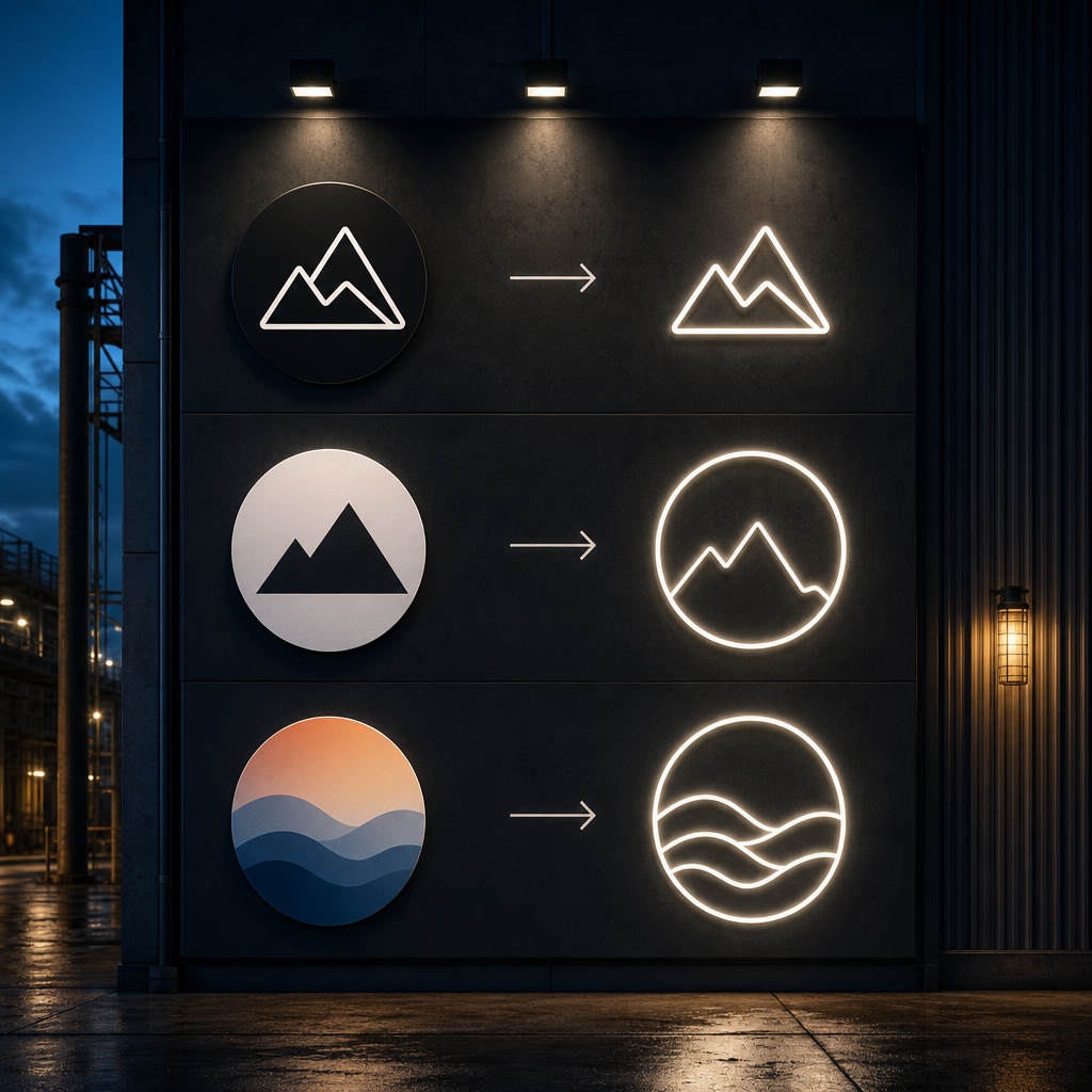 A logo is neon-ready when it can be drawn as continuous lines of even weight with clear gaps between them. Line-based marks convert easily. Filled shapes, gradients, fine detail and small text usually need outlining, simplifying or redrawing so the lit version still reads as your brand.
LED neon is a flexible tube that carries light along a path. That one fact shapes every decision. Anything that cannot be expressed as a path, such as a solid block of colour or a soft shadow, has to be translated.
Line-based versus filled and gradient logos
Line-based logos are the easiest. Think of a monoline icon, a simple outline badge or a wordmark in an even-weight typeface. Each stroke becomes a run of neon, and the logo keeps its proportions.
Filled shapes are different. A solid circle or a heavy block letter cannot be filled with light the way a screen fills it with pixels. The usual fix is to outline the shape, so the edge glows and the interior is left open. Sometimes the interior is printed on the acrylic backing, which keeps the shape visible without needing extra tubing.
Gradients cannot be built from a single tube. A sunset fade or a blue-to-green transition has to be reduced to one or two colours, or to an RGB option if the colour-changing effect suits the brand. Reducing a gradient to its dominant colour is usually the cleanest answer.
Fine detail and small text
Neon tubing has a physical thickness and a minimum bend radius. Tight curves, tiny counters inside letters and closely spaced lines can merge into one glowing blob. Your signmaker will confirm the minimum stroke and gap sizes for the tubing used, and those limits scale with the overall size of the sign.
Small text is the most common casualty. A tagline under a logo that reads fine on a business card often cannot be built in neon at the same proportion. You have three choices:
- Remove the tagline from the neon and keep it on printed signage nearby.
- Enlarge the whole sign so the text becomes buildable.
- Print the small text on the acrylic backing instead of building it from tubing.
The third option is worth considering. Printed or engraved detail on the backing keeps information in the design without asking the neon to do something it cannot.
Why some elements need outlining or redrawing
Outlining and redrawing are not compromises. They are the normal part of converting a logo for a different medium, in the same way a logo is adjusted for embroidery or a vehicle wrap.
Redrawing usually involves four steps:
- Convert filled shapes to outlines or single-line paths.
- Remove overlapping elements that would force tubes to cross.
- Even out stroke weight so the lit line looks consistent.
- Smooth tight corners and joins to suit the tubing's bend radius.
The goal is recognition, not replication. If someone who knows your brand can identify the lit sign from across the room, the conversion has worked.
What a good simplification looks like
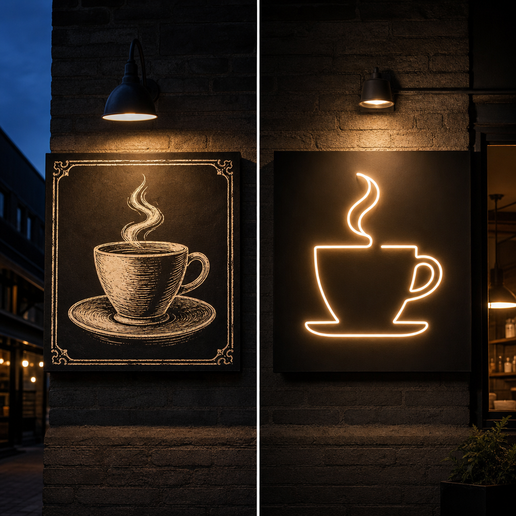
Consider a café with a detailed illustrated logo: a coffee cup with steam, a hand-drawn border, shading on the cup and a script name beneath. On a menu it looks charming. In neon, the shading disappears, the border adds visual noise and the script name has loops too tight to bend.
The neon version keeps the cup outline and one swirl of steam as a single continuous line. The border is dropped. The name is set in a clean, even-weight style that echoes the original script's character. Everything that carried the brand's personality, the cup shape and the steam curl, stays. Everything that was texture goes. Customers still recognise the café, and the sign now looks designed for light rather than squeezed into it.
This is a hypothetical example, but the logic applies to most detailed marks. Keep the silhouette and the one or two features people remember. Let the rest go.
From Artwork to Neon: Files, Mock-Ups and Colour Matching
The process runs in three steps: supply a vector file, review a mock-up showing the simplified design in place, and approve the colours before anything is built. Getting the file and the colours right at the start prevents most revisions later.
Supplying vector files
A vector file is the best starting point because it describes your logo as paths rather than pixels. Common formats include AI, EPS, SVG and a clean PDF exported from design software. A vector can be scaled to any size without blurring, and the signmaker can trace the paths directly.
If you only have a JPG or PNG, do not worry. Send it anyway. A raster image can usually be redrawn, though it takes more time and the result depends on how clear the original is. Your original designer or the platform you used to create the logo may also be able to export a vector copy.
It also helps to send any brand guidelines you have. A short note on which elements are essential and which are flexible saves back-and-forth. For example, tell the signmaker if the icon must stay exactly as is but the wordmark can be simplified.
The mock-up and approval stage
The mock-up is where the logo becomes a sign. It should show the simplified design, the proposed colours, the backing shape and, ideally, the sign on a photo of your wall or window. Seeing it in context helps you judge scale and position in a way a flat drawing cannot.
Use the mock-up to check these things:
- Is the logo still recognisable at a glance?
- Has anything essential been dropped?
- Are the proportions between icon and text right?
- Does the size suit the wall and the viewing distance?
- Where will the power supply and cable run?
Approve only when you are satisfied. Changes after the build starts are harder and often cost more, so this stage is where to be fussy.
Colour matching brand colours to LED neon
Brand colours are usually specified as Pantone, CMYK or hex values. Those describe ink or screen colour. LED neon emits light, so it cannot copy an ink colour exactly. A signmaker picks the closest option from the available LED neon colour range.
A few practical points help:
- Bold, saturated brand colours such as red, blue, green and orange tend to translate well.
- Pale tints and muted tones often look washed out or shift towards white when lit.
- Very dark colours, such as navy or charcoal, do not read as light at all. They are often swapped for a brighter relative or handled through the backing.
- Colours look different on screen, off, and lit in a dim room. Ask how the sign will look when on, not just when off.
If your brand uses several colours, you can build a multi-colour sign by joining separate runs of tubing. Keep the palette tight, because each additional colour adds complexity and visual noise.
RGB and colour-changing options
An RGB neon sign can display many colours and change between them using a controller. That suits venues, bars and event spaces where mood and lighting change through the day. It can also help when a brand colour is hard to match with a fixed LED colour.
Be thoughtful, though. A logo that shifts through a rainbow can weaken recognition if your brand relies on one signature colour. For most business logos, a fixed colour that matches the brand is the stronger choice. Reserve RGB for situations where flexibility is the point.
Backing and Mounting for Logo Neon
Logo neon is usually mounted on clear or coloured acrylic, either cut to follow the logo outline or left as a simple rectangle. Cut-to-shape suits marks with a strong silhouette. Rectangular suits wordmarks and complex layouts. Mounting is then wall, window or suspended, depending on the space.
This section covers the logo-specific side only. For a wider comparison of backing materials, see the Custom LED Neon Signs: A Complete Guide.
Cut-to-shape versus rectangular acrylic
A rectangular backing is the simple option. It frames the logo, keeps the design contained and is easy to hang. It works well for wordmarks, stacked layouts and logos where the overall shape is already roughly square or wide.
A cut-to-shape backing follows the outline of the logo. The acrylic looks like part of the design, and the sign appears to float on the wall without a visible frame. It suits icons with a clear silhouette, such as a leaf, a paw print, a crown or a badge.
Which one is better depends on the logo:
- Choose cut-to-shape when the logo has a distinctive outer edge and you want it to feel like an object.
- Choose rectangular when the logo is wordmark-heavy, has scattered elements, or you want a clean block that is simple to install and move.
How laser-cut backing follows the logo outline
Laser cutting lets acrylic be shaped to follow a vector path precisely. The same logo outline used for the neon layout becomes the cut line for the backing, which keeps the two perfectly aligned. Small details, such as curves and notches, are held cleanly.
There are practical limits. Very narrow connections between parts can weaken the acrylic, and tight internal cut-outs may need to be simplified. That is another reason to approve the mock-up carefully. The cut outline is part of the design, not an afterthought. Acrylic laser cutting for signage is a service in its own right at Sunquest, and the same file preparation applies.
You can also combine approaches. The backing can be cut to the logo's overall silhouette, while printed or engraved detail on the acrylic carries elements that are too fine for tubing.
Wall, window and suspended mounting
Wall mounting is the most common choice for reception areas and feature walls. The sign sits on stand-offs, which creates a gap between acrylic and wall. That gap lets light spill behind the sign and adds depth. The wall surface matters. Brick, plasterboard, timber and tile all need appropriate fixings.
Window mounting places the sign inside the glass so it faces the street. It can be fixed to the glass, hung from the ceiling just behind it, or mounted to a frame. Because the logo faces outward, check how it reads from the street, and remember it will appear reversed from inside if the design is not symmetrical. Your signmaker should confirm the orientation in the mock-up.
Suspended mounting hangs the sign from the ceiling on cables or chains. It suits venues with high ceilings, open-plan offices and spaces where the sign needs to be seen from several angles. A double-sided design is possible when the sign will be viewed from both sides.
Placement and Sizing
The best placement puts the logo where people already look: behind reception, above the counter, in the window or on the main feature wall. Size is set by viewing distance. The further away the viewer, the larger the sign and the simpler the design need to be.
Reception, counter, window and feature wall
Each location has a different job.
- Reception wall. This is the first brand impression for offices, clinics and salons. A neon sign for a reception wall should sit above or beside the desk, at a height visitors can see while standing or seated in the waiting area. Keep it out of glare from windows.
- Counter or service area. In cafés and boutiques the logo behind the counter is seen during every transaction. Check that it is not hidden by staff, equipment or shelving.
- Shopfront window. A shopfront window neon logo is the sign that works after hours. Place it where it is visible from the footpath and not blocked by stock, decals or reflections.
- Feature wall. This is the photo spot. Leave floor space in front so customers can stand back, and think about the surrounding wall colour. A dark wall makes neon pop. A bright or busy wall can flatten it.
How viewing distance affects size
Size is a function of how far away the sign will be read. A logo viewed from a metre or two across a reception desk can be small and detailed. A logo meant to catch someone's attention from across a room, or from the footpath through glass, needs to be larger and simpler.
A useful rule of thumb: if you have to squint to separate two elements from the viewing position, they are too close together or too small. Either enlarge the sign or drop the detail. Your signmaker can calculate sensible dimensions from the mock-up and the real distance, so measure your space and take a photo from where customers will stand.
Also consider proportion to the wall. A sign that is too small looks lost. A sign that is too large overwhelms the space and can look aggressive. Place a paper cut-out or a taped outline on the wall at the proposed size before you approve. It is a simple check that avoids a lot of regret.
Indoor versus outdoor and weather-exposed installs
Most logo neon is designed for indoor use. Reception walls, feature walls and the inside of shopfront windows are the sweet spot, because the sign is protected from rain, dust and direct sun.
Outdoor and weather-exposed installs are a different matter. Rain, humidity, salt air, heat and UV all affect materials over time. Coastal locations across the Sunshine Coast and Fraser Coast are especially demanding. Any sign that will be exposed needs to be built and rated for it. Ingress protection ratings, defined under the IEC 60529 standard, describe how well an enclosure resists dust and water. Ask your signmaker which rating applies and whether the power supply is protected too.
Covered areas, such as under an awning or inside a deep entry, sit in between. They reduce direct rain but do not remove humidity or wind-driven moisture. If you are unsure, treat the position as exposed and ask for advice. Regular checks also help any lit sign last, and our guide to illuminated sign maintenance covers that routine.
Local rules can apply too. Requirements for signs visible from public areas vary by council, so check with Sunshine Coast Council or Fraser Coast Regional Council if the sign will face the street or be fixed to an external surface.
Pairing Logo Neon with Other Signage
Logo neon works best as part of a signage mix. Use lightboxes or LED channel letters on the external facade for long-range visibility and weather resistance, and keep neon inside for atmosphere, photos and window glow. Each type does a different job.
When a lightbox or channel letters suit the facade better
External facades face sun, rain, wind and long viewing distances. Lightboxes and LED channel letters are built for that environment. Channel letters give a clean, dimensional brand name that reads from the road. A lightbox gives a large, evenly lit panel that carries a full-colour logo, gradients included.
That last point matters. If your logo relies on a gradient, photo-style detail or many colours, a lightbox can display it faithfully while neon cannot. Use the right tool for the right surface. If you are weighing options, our LED channel letter signs page explains how those signs are built and where they suit best.
Using neon inside to carry the brand story
Once the facade does the heavy lifting for visibility, the neon logo inside can focus on feel. It adds warmth, personality and a place for customers to stop and take a photo. It also reinforces what they saw outside, so the brand is consistent from the footpath to the counter.
A simple, effective mix looks like this:
- Facade: channel letters or a lightbox with your name and logo.
- Window: a neon logo or short line facing the street for after-hours glow.
- Interior: a larger neon logo on the reception or feature wall for photos and recall.
This layered approach also protects your investment. Weather-exposed work is handled by products designed for it, and the neon sits in a protected, controlled spot where it will look its best for longer. For a broader view of how these signs fit together, the Business and Shopfront Signs hub gives an overview.
If you are in the area, local examples are also worth a look. Businesses in places like Caloundra and Noosa often combine a bold facade sign with a neon feature inside, and that pairing suits the coastal retail and hospitality style well.
Why the Neon Version of Your Logo Is Its Own Brand Asset
The usual advice is to make your logo fit neon. My view is the opposite way round: treat the neon version as a brand asset in its own right, and design it deliberately. Most businesses already keep a one-colour version, a reversed version and an icon-only version. A neon-ready line version belongs in that set.
Here is the reasoning. A neon sign forces you to decide what your logo is really made of. When you strip away shading, texture, borders and taglines, what remains is the part customers actually remember. That is useful information, and it is worth keeping beyond the sign itself.
A simplified line version of your mark often earns its place elsewhere. It can suit window decals, engraved timber, embroidered uniforms, embossed packaging or a social media profile image at small size. The work done for the neon sign becomes reusable. Nobody has to redraw the logo each time a new medium comes up.
There is also a contrarian point. Not every logo should be converted. If your mark depends on a photographic gradient, a dense illustration or many fine details, forcing it into neon can weaken the brand. In that case, a better choice may be a simplified secondary mark used only for neon, or a different sign type such as a lightbox for the full-colour logo. A signmaker who tells you this up front is doing you a favour.
The practical test is simple. Draw your logo from memory using only a single line. Whatever you keep is the neon logo. If that sketch still feels like your brand, the sign will too.
Send Your Logo for a Free Mock-Up
The quickest way to find out whether your logo suits neon is to see it. Send your logo file to Sunquest Signs and we will prepare a free design mock-up and quote for a custom logo neon sign. Include a photo of the wall or window, a rough idea of the size you have in mind, and any brand colour references.
We work with businesses across the Sunshine Coast and Fraser Coast, from cafés and salons to gyms, offices, boutiques and venues. If you are not sure which sign suits which space, tell us about the location and we will recommend a sensible mix.
References
- International Electrotechnical Commission (IEC). IEC 60529: Degrees of protection provided by enclosures (IP Code). https://www.iec.ch/
- Standards Australia. AS/NZS 3000: Electrical installations (Wiring Rules). https://www.standards.org.au/
- Sunshine Coast Council. Planning and development information. https://www.sunshinecoast.qld.gov.au/
- Fraser Coast Regional Council. Planning and development information. https://www.frasercoast.qld.gov.au/
Talk to a signage expert
Tell us about your project and we'll come back with options and honest advice.
Get in TouchFrequently Asked Questions
Can any business logo be made into a neon sign?
Most logos can be adapted, but not all can be copied exactly. Line-based logos convert easily. Filled shapes, gradients and fine detail are usually outlined, simplified or redrawn so the lit sign remains recognisable. A signmaker will show you the neon version in a mock-up before anything is built.
What file format do I need to supply for a custom logo neon sign?
A vector file is best, such as AI, EPS, SVG or a clean PDF. These scale without losing quality and let the signmaker trace the paths directly. If you only have a JPG or PNG, send it anyway, as it can usually be redrawn, though that may take longer.
Will the neon colours match my brand colours exactly?
Not exactly, because LED neon emits light while brand colours are specified as ink or screen values. A signmaker chooses the closest available LED colour. Bold, saturated colours match well. Pale tints and very dark colours are harder, and RGB options can help in some cases.
Can I put a neon logo sign in my shopfront window?
Yes, inside the glass is one of the most popular positions, and it keeps working after closing time. Check the sign's orientation so it reads correctly from the street. If it will be fixed outside or is visible from public areas, check local council requirements first.
Is a neon logo sign suitable for outdoor use?
Only if it is built and rated for exposure to weather. Most logo neon is designed for indoor use, including the inside of windows. For exposed facades, lightboxes or LED channel letters are usually the better choice, with neon used inside.
What is the difference between cut-to-shape and rectangular backing?
Cut-to-shape acrylic follows the outline of your logo, so the sign looks like a single object on the wall. Rectangular acrylic frames the logo in a simple panel. Cut-to-shape suits strong silhouettes. Rectangular suits wordmarks and complex layouts.
Related Articles
Window Decals and Graphics for Sunshine Coast Shopfronts: Types, Coastal Materials, Rules and Costs
Indoor vs Outdoor Neon Signage: How to Choose the Right LED Neon for Your Space
Neon Signs in Caloundra: Custom LED Neon for Shopfronts, Cafés and Venues
Signs that set you apart
Over 40 years on the Sunshine Coast. Design, compliance, manufacture and installation handled end to end.
Get a Free Quote