Channel Letter Signs
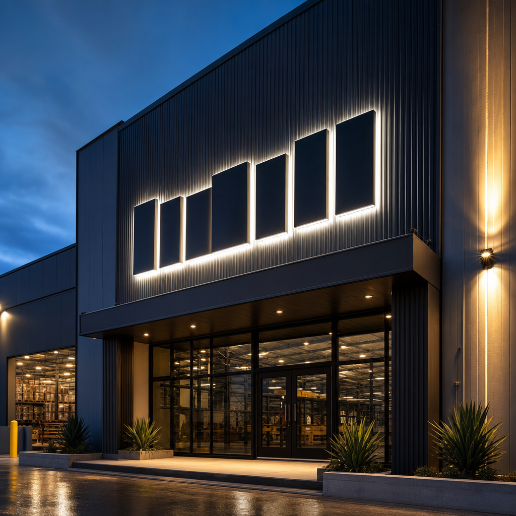
Channel letter signs are individually fabricated letters or logos, usually fitted with LED illumination and installed on a building facade. Businesses use them for clear, professional identification during the day and at night. The right design depends on viewing distance, brand requirements, mounting conditions, local approvals, electrical access and future maintenance needs.
Channel lettering can make a storefront easier to recognise without covering the facade with a large sign panel. Each character has physical depth, so the sign creates stronger definition than flat lettering.
This guide explains the main channel letter types, materials, illumination methods, mounting systems and approval issues. It also covers design decisions that affect legibility, reliability and whole-of-life value.
Key takeaways
Channel letter signs work best when fabrication, typography, lighting and installation are considered together. Choosing a style from a catalogue without assessing the building can create approval problems, uneven illumination or expensive servicing. Start with visibility and site conditions, then select the letter construction and mounting method that support them.
- Front-lit letters provide direct, highly visible illumination for most retail and commercial facades.
- Reverse-lit letters create a halo on the wall and suit restrained architectural branding.
- Combination-lit letters illuminate the face and rear, but require careful brightness control.
- Direct mounting produces a cleaner result, while a raceway can simplify wiring and reduce facade penetrations.
- Letter depth, stroke width and spacing affect both legibility and the space available for LEDs.
- Planning approval, landlord consent and licensed electrical work should be addressed before manufacture.
Ready to make your business impossible to miss?
Design, manufacture and installation, all under one roof in Warana.
Get a Free QuoteChannel letter options at a glance
The main options differ in where light exits, how each letter is constructed and what background the sign needs. The table provides an initial comparison, but site access, wall colour, viewing angle and local planning controls can change which option is most suitable.
| Sign type | Illumination | Typical visual result | Best suited to | Main consideration |
|---|---|---|---|---|
| Front-lit | Light passes through the letter face | Bright, direct and easy to read | Retail, hospitality and commercial identification | Face colour and LED layout must produce even illumination |
| Reverse-lit | Light projects behind each letter | Halo around solid letter faces | Architectural facades and premium branding | The wall must reflect light consistently |
| Combination-lit | Light exits through the face and rear | Illuminated face with a surrounding halo | Sites requiring strong day and night presence | Brightness balance can be difficult on reflective surfaces |
| Open-face | Light source remains intentionally visible | Exposed, decorative appearance | Entertainment and themed venues | Weather protection and planning restrictions require attention |
| Non-illuminated | No internal lighting | Dimensional lettering visible in daylight | Internally lit sites or locations with external floodlighting | Night-time visibility depends on ambient light |
What are channel letter signs?
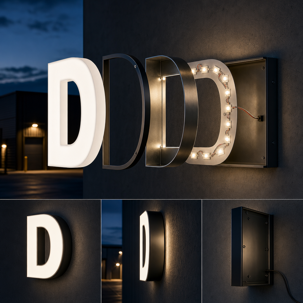
Channel letter signs are dimensional characters built as separate letter or logo forms rather than printed on one continuous panel. A typical illuminated letter combines a fabricated return, a front or rear surface, internal LED modules and concealed electrical connections. The construction forms a channel that contains and directs the light.
The face is the visible front of the character. Front-lit designs commonly use translucent acrylic so light can pass through evenly. The return forms the side wall and gives the letter depth. A back panel closes the channel or supports the internal components, depending on the illumination method.
This construction has several practical benefits:
- Individual letters create a strong architectural appearance.
- The sign can follow a logo's shape more closely than a rectangular lightbox.
- Illumination is concentrated within each character.
- Damaged components can often be assessed by letter rather than replacing an entire sign panel.
- Different face, return and lighting combinations allow substantial customisation.
Channel letters are not automatically suitable for every logo. Very narrow strokes, tight internal spaces and delicate shapes may leave insufficient room for effective lighting or secure fabrication. In those cases, dimensional lettering, an illuminated sign box or a simplified logo element may produce a cleaner result.
Which channel letter type should you choose?
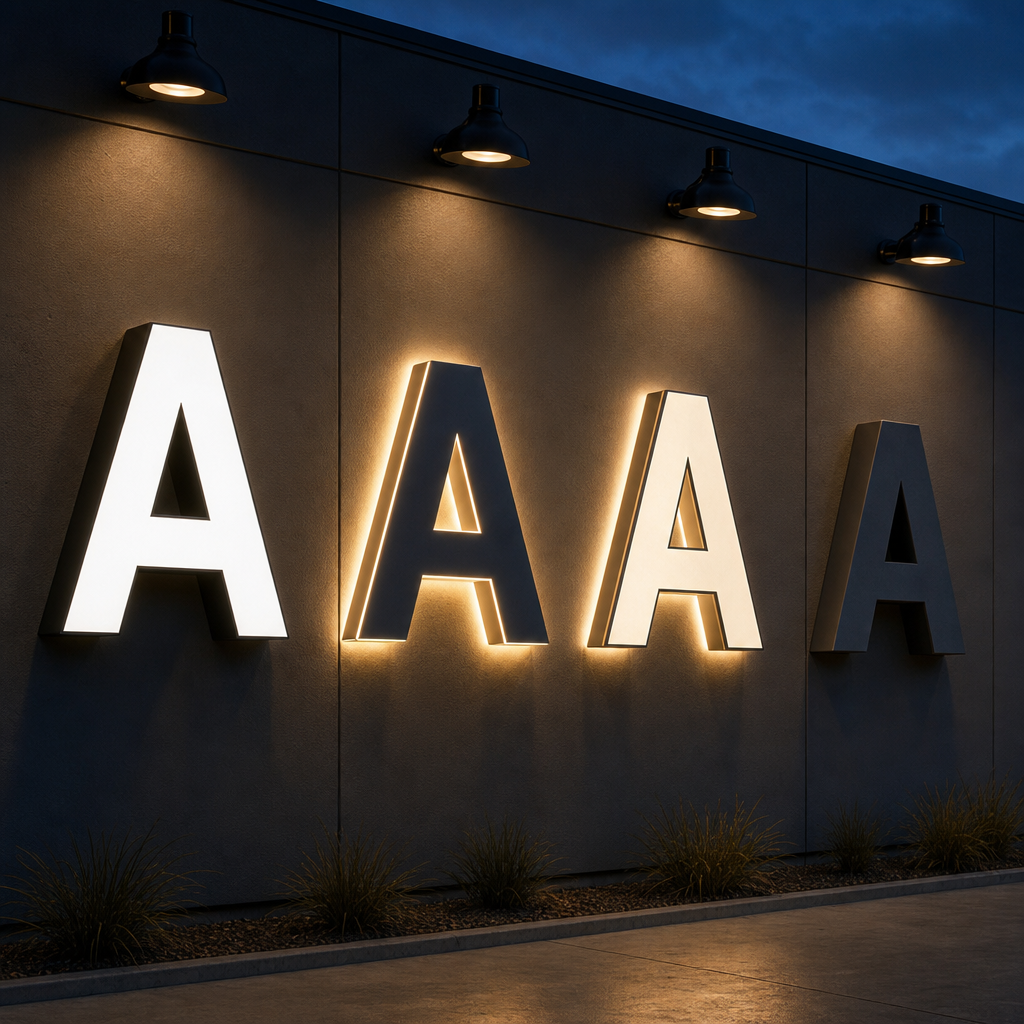
Choose the type according to the desired night-time effect, the facade material and the amount of visual prominence required. Front-lit letters are usually the most direct option. Reverse-lit letters depend heavily on the wall behind them, while combination lighting offers more presence but introduces additional design and installation complexity.
Front-lit channel letters
Front-lit letters have translucent faces that emit light towards the viewer. They are commonly selected when distance visibility and straightforward brand colour reproduction matter.
The face may use coloured acrylic, translucent film or a printed treatment. Dark corporate colours need testing because an opaque-looking daytime colour may block too much light at night. A workable specification must account for both modes rather than treating the illuminated appearance as an afterthought.
LED placement also matters. Modules positioned too far apart can create visible bright spots. Modules too close to the face may reveal individual light sources. Letter depth, module spacing and the optical properties of the face need to work as a system.
Reverse-lit channel letters
Reverse-lit letters have opaque faces and project light from the rear onto the mounting surface. This creates a halo around each character.
The background is part of the optical design. A pale, matte wall usually reflects light more evenly than dark brick, corrugated cladding or highly polished stone. Uneven masonry can break up the halo. Glossy surfaces can produce distracting reflections.
Letters are normally held away from the wall so light can spread behind them. The offset must be consistent across the sign, including where the facade changes level.
Combination-lit channel letters
Combination-lit letters emit light from the face and rear. This can provide strong identification while retaining the architectural depth of a halo.
More light is not automatically better. The face and halo should remain visually distinct rather than merging into glare. This is particularly important near residential properties, glazed facades or roads where excessive brightness may create complaints or approval issues.
Open-face and non-illuminated letters
Open-face letters expose the internal light source as part of the design. They can create a deliberate decorative effect, but outdoor applications require careful component selection and weather management.
Non-illuminated channel letters retain the dimensional form without internal lighting. They may suit shopping centres with strong ambient lighting, heritage settings or buildings where separate facade lighting is available.
How are channel letters manufactured?
Channel letters are manufactured by converting approved artwork into buildable character shapes, fabricating the returns and backs, preparing faces, installing lighting components and testing the finished assembly. Accurate artwork matters because small changes to stroke width, corner radius or spacing can affect structural strength, illumination and the final brand appearance.
Fabricated aluminium is commonly used for returns and backs because it is comparatively light, durable and workable. Acrylic is commonly used for illuminated faces. Other metals can be specified where a particular finish or architectural result is required.
A sound production process should resolve several details before fabrication begins:
Artwork and letter geometry
Vector artwork allows characters to be scaled without losing edge accuracy. The fabricator must then assess whether every detail can be physically formed.
A logo designed for a website may contain narrow gaps or sharp corners that cannot house LEDs or face-retaining components. Controlled adjustment is often preferable to producing a sign that follows the file precisely but performs poorly.
Face retention and edge finish
Front-lit faces need a secure method of attachment. Trim around the face can hold acrylic in place and protect its edge. Trimless construction creates a different appearance but may require tighter fabrication tolerances.
Return colour affects daytime presentation. It can match the face, match the facade or create deliberate contrast. Black returns can make letters appear more defined during the day, while lighter finishes may integrate with pale cladding.
LED layout and power access
LED modules should be arranged around the actual character geometry, not applied with one generic spacing pattern. Wide letters, narrow strokes and enclosed counters distribute light differently.
Power supplies also need accessible, ventilated and weather-appropriate locations. Concealing them without planning future access can turn a routine replacement into a difficult building repair.
Workshop testing
Testing should check illumination consistency, colour appearance, wiring, component security and the relationship between adjacent letters. A sign can appear balanced on a workshop floor but behave differently against the site's wall colour, so material samples and site photographs remain important.
How are channel letter signs mounted?
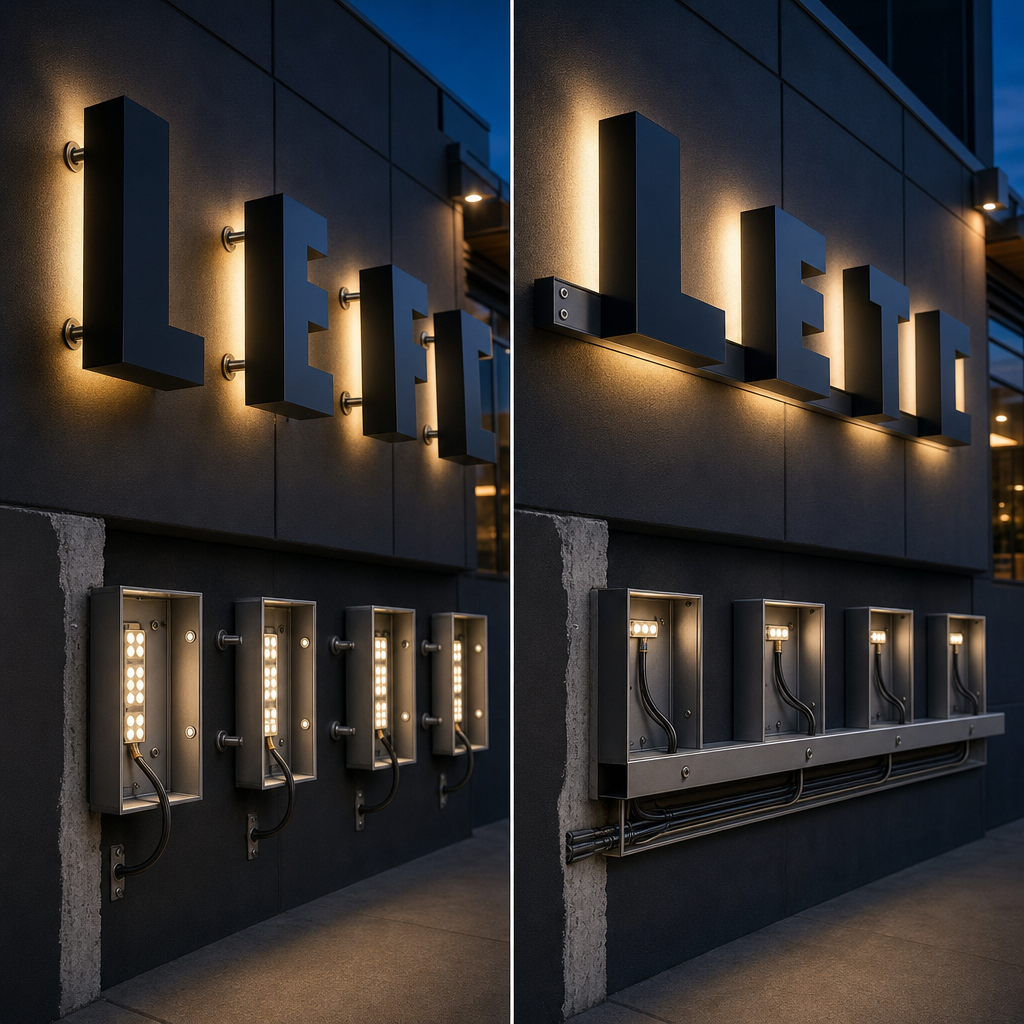
Channel letters are generally fixed directly to the building or attached to a raceway that carries wiring and supports the characters. Direct mounting offers a cleaner architectural finish. Raceway mounting can reduce individual wall penetrations and make electrical servicing easier, particularly where rear access to the facade is limited.
Direct mounting
With direct mounting, each character is positioned on the facade using a full-size installation pattern. Fixings and cable penetrations are made for individual letters.
The result can look highly integrated because there is no visible support rail. However, installation takes more coordination. The wall must accept suitable fixings, and cable routes need to be planned around studs, cavities, services and waterproofing systems.
Direct mounting is not simply a visual choice. On some facades, numerous penetrations may create unnecessary risk. Building owners may also restrict drilling into stone, glazing systems, insulated panels or recently installed cladding.
Raceway mounting
A raceway is a fabricated enclosure behind the letters. It can house cables and support several characters as one installed assembly.
This method often simplifies servicing because electrical connections remain concentrated within the enclosure. It may also reduce penetrations into the building. The trade-off is a visible background element that must be sized and finished carefully.
A raceway should not look like an accidental box behind the logo. Matching its finish to the facade can make it less prominent. Where contrast is unavoidable, its proportions should form a deliberate part of the sign design.
Structural and access considerations
The installer needs to consider wall construction, wind exposure, sign weight, access equipment and public safety. A low awning installation presents different risks from lettering high on a commercial building.
Site access can also affect the design. If future servicing requires road occupation, traffic control or specialist access equipment, maintenance costs may outweigh a cheaper initial mounting decision.
What makes a channel letter sign effective?
An effective channel letter sign is readable quickly, faithful to the brand and appropriate for its surroundings. Size alone does not guarantee visibility. Letter shape, spacing, contrast, viewing angle and background clutter determine whether people can identify the business while walking or approaching in a vehicle.
Prioritise recognisable word shapes
People often recognise the overall shape of a familiar name before processing every character. Excessive compression, tight spacing and decorative letterforms weaken that pattern.
Maintain clear gaps between characters and preserve open internal spaces. If illumination closes those spaces visually at night, the sign can look heavier than it does during the day.
Design for the actual approach
A facade elevation is not the same as the customer's view. A sign may be seen from an angle, through trees, beneath an awning or among competing tenancy signs.
Site assessment should identify the main approach paths, obstructions and available sightlines. Letter depth and return colour can become more noticeable from oblique angles, so side appearance may matter almost as much as the face.
Control brightness rather than maximising it
The aim is useful contrast, not maximum output. Excessive brightness can wash out letter edges, reduce comfort and create glare on glazing or wet surfaces.
The International Dark-Sky Association explains that poorly directed artificial light contributes to light pollution and recommends using light only where and when it is needed (DarkSky International). Channel letters naturally contain much of their light, but output and direction still require control.
Protect brand consistency
Material samples should be reviewed in both daylight and illuminated conditions. A colour that matches printed brand material under office lighting may shift when backlit.
Trade mark owners should also control how protected logos are reproduced. IP Australia provides guidance on trade marks and the rights attached to registered branding (IP Australia).
What approvals and electrical requirements apply in Australia?
Australian channel letter projects may require council approval, landlord consent, engineering input and licensed electrical work. Requirements vary by state, council, zoning, building type and sign dimensions. Confirm the approval pathway before manufacture because changing letter size or placement after fabrication can be costly and may compromise the intended design.
Local planning controls can regulate illumination, sign area, movement, heritage impacts and proximity to roads or homes. Brisbane City Council, for example, publishes guidance covering advertising signs and the approvals that may apply (Brisbane City Council). Other councils use their own planning schemes and application processes.
Landlord approval is separate from council approval. Shopping centres and commercial property owners may impose signage manuals covering size, colours, fixing methods, cable routes and approved contractors.
Illuminated signs also involve electrical work. Licensing requirements vary by jurisdiction, so engage appropriately licensed contractors. WorkSafe Queensland outlines the electrical work that requires an electrical licence in Queensland (WorkSafe Queensland). Comparable state or territory requirements apply elsewhere.
Before ordering, clarify:
- whether development or building approval is required
- whether the site has heritage or character controls
- who owns the facade and must consent
- where power will be supplied
- who will isolate the circuit for maintenance
- whether access equipment affects public areas or roads
- how penetrations will be sealed and documented
How should channel letter signs be maintained?
Channel letter signs need periodic inspection, cleaning and electrical assessment to maintain an even appearance. The maintenance plan should reflect the sign's height, exposure, facade material and access method. Designing for safe access from the beginning usually matters more than selecting the cheapest replaceable component.
Dirt on acrylic faces reduces light output and can make adjacent letters appear mismatched. Coastal salt, traffic residue, insects and organic growth can also collect around returns and drainage points.
Useful inspection items include:
- face cracking, discolouration or movement
- loose trim or fixings
- water entry and blocked drainage
- flickering or dark LED sections
- inconsistent colour between letters
- corrosion around fasteners and joins
- damaged sealant at wall penetrations
- power supplies that overheat or cycle off
A single dark letter does not always mean every LED has failed. The cause may be a disconnected cable, failed power supply, moisture entry or a local module fault. Proper diagnosis avoids replacing parts unnecessarily.
Cleaning methods should suit the face material and finish. Abrasive pads, aggressive solvents and high-pressure washing can damage acrylic, coatings, seals or electrical enclosures.
Why serviceability beats maximum brightness
The overlooked design criterion is not brightness. It is serviceability. A moderately illuminated sign with accessible power supplies, sensible cable routes and replaceable faces will usually be a better business asset than an intensely bright installation that requires facade removal or specialist access whenever one component fails.
Many channel letter comparisons focus on front-lit versus reverse-lit construction. That distinction matters, but it does not address who can safely open the sign, where drivers are located or whether replacement components can pass through the available access point.
A practical specification should treat maintenance as a design input. Ask where each component will be reached, how power will be isolated and whether removing one face affects surrounding letters. Consider whether an installer can diagnose the sign without damaging the waterproofing system.
This leads to a useful decision rule: choose the simplest construction that delivers the required brand effect and visibility. Additional lighting layers, concealed fixings and unusually shallow letters may look appealing in a rendering, but each can narrow service tolerances.
The best channel letter sign is not the one with the most features. It is the one that remains legible, compliant and repairable on the actual building.
Planning your channel letter project
Begin with a site assessment and accurate brand artwork, then confirm the desired day and night appearance. Resolve approvals, landlord requirements, electrical access, mounting and maintenance before finalising fabrication drawings. This sequence reduces redesign and ensures the visual concept can be installed safely on the chosen facade.
Provide the sign company with:
- vector logo and lettering files
- brand colour references
- facade photographs and available drawings
- approximate sign location
- landlord or centre signage guidelines
- preferred illuminated appearance
- normal viewing directions
- information about existing power and access
Request drawings that show overall placement, individual letter dimensions, return depth, face material, colours, mounting method and cable routing. For illuminated work, ask how the sign will appear at night and how power supplies can be accessed.
Price should be considered alongside fabrication quality, access, approvals and maintenance. Two quotations may describe similar channel letters while allowing for very different materials, fixing systems or service access.
For advice on a site-specific channel letter sign, contact Sunquest Signs through the /contact page. Supply facade images and logo artwork so the team can assess construction, mounting and illumination options.
References
These sources provide relevant Australian guidance on branding rights, advertising sign approvals and electrical licensing, together with broader guidance about responsible exterior lighting. Local council and state requirements should still be checked for the specific property because approval and licensing rules vary by jurisdiction.
- IP Australia: Trade marks
- Brisbane City Council: Advertising signs
- WorkSafe Queensland: Electrical licences
- DarkSky International: What is light pollution?
Talk to a signage expert
Tell us about your project and we'll come back with options and honest advice.
Get in TouchFrequently Asked Questions
Are channel letter signs illuminated?
Channel letters can be illuminated or non-illuminated. Front-lit letters shine through a translucent face, reverse-lit letters create a halo, and combination-lit letters use both effects.
What is the difference between front-lit and reverse-lit channel letters?
Front-lit letters direct light through the face towards the viewer. Reverse-lit letters have opaque faces and project light behind the characters to create a halo on the facade.
Can channel letters reproduce any logo?
Not every logo can be fabricated exactly as drawn. Narrow strokes, tiny gaps and complex shapes may require controlled adjustments or a different sign construction.
Do channel letter signs require council approval?
Channel letters may require council approval depending on the location, zoning, size, illumination and local planning controls. Landlord consent may also be required.
How long do channel letter signs last?
Service life depends on material quality, exposure, electrical components, installation and maintenance. Buyers should assess warranties, component access and the maintenance plan rather than relying on a generic lifespan claim.
Signs that set you apart
Over 40 years on the Sunshine Coast. Design, compliance, manufacture and installation handled end to end.
Get a Free Quote